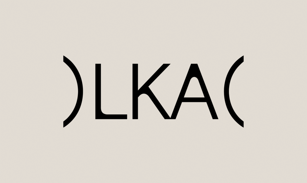
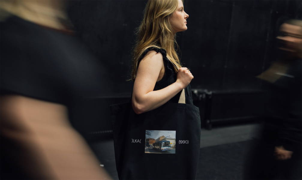
As the Latvian Academy of Culture (LKA) celebrates its 35th anniversary and prepares to move to a new home in the Tobacco Factory quarter, the institution has unveiled a new visual identity. The core of the brand’s visual system, created by the design studio Overpriced, consists of inverted brackets — a symbolic metaphor that positions culture not as an isolated entity, but as an open and inviting space that encompasses countless forms of expression.
The new visual identity marks a new phase in the development of the Latvian Academy of Culture. In 2025, the institution reached its highest number of applicants to date; the merger of the LKA and the Latvian College of Culture took place, and the development of the new creative quarter on Miera iela began. «The new identity very accurately reflects the academy’s dynamic character — the environment where creativity, studies, and research, closely linked to today’s cultural processes, develop side by side. This is not just a visual refresh but also a clear signal of the academy’s direction for the future,» comments Dāvis Sīmanis, rector of LKA.
The rebranding process began in 2025 with the creation of a brand strategy by the agency White Label. An analysis of audience opinions revealed a significant challenge — the public still tends to question the practical value of culture, which often influences attitudes toward cultural education as well. Therefore, the LKA brand incorporates the idea of the academy as a place where strong personalities are formed, people who not only strengthen the cultural sphere through their work but are also capable of inspiring and changing society.
Overpriced notes that the new visual identity was created to reflect the core premise of the brand’s strategy: «The educational institution is no longer a place that passively preserves cultural heritage — it has become a forge for strong and self-assured industry professionals, change-makers who shape culture and challenge existing norms.» This led to leaving the academic heraldry behind and seeking a new symbol that would better unite the LKA’s many facets.
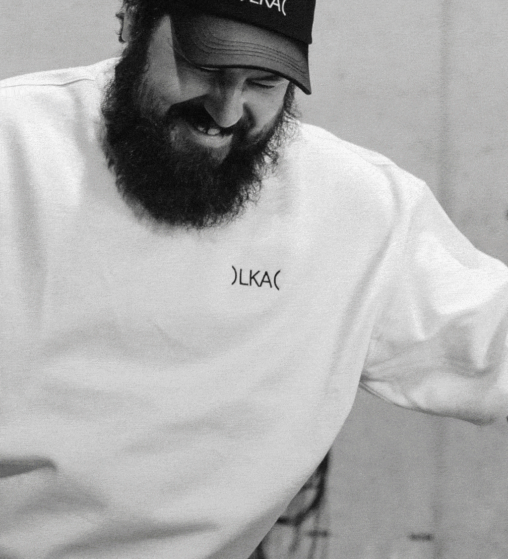
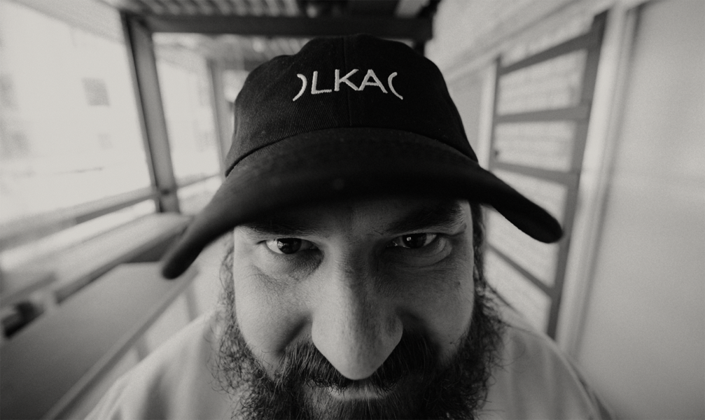
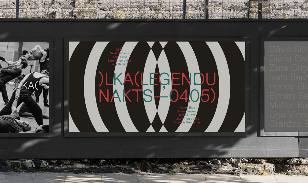
The visual system is based on inverted brackets. «Unlike conventional brackets, which frame and isolate content, inverted brackets create a magnetic and active space. This laconic graphic gesture does not decorate but rather meaningfully structures information. It serves as a bridge between seemingly different fields — from film and theatre to contemporary dance and scientific research — marking the academy as a unified interdisciplinary platform,» designers explain.
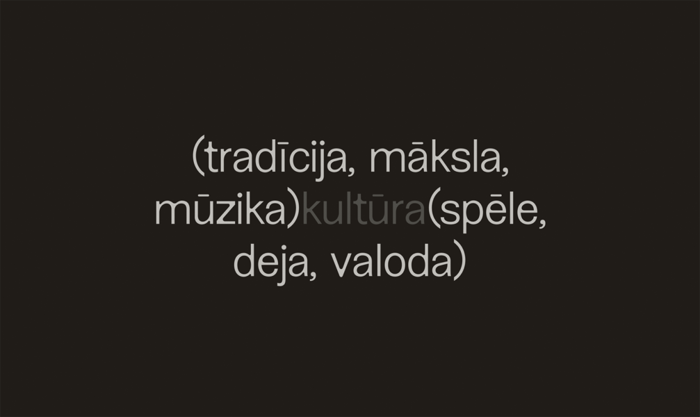
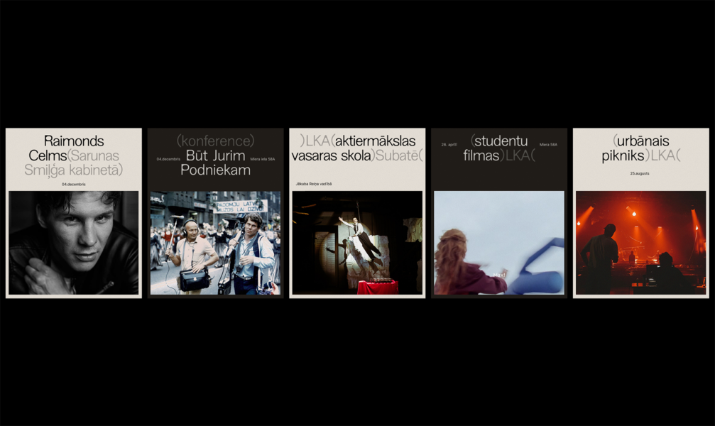
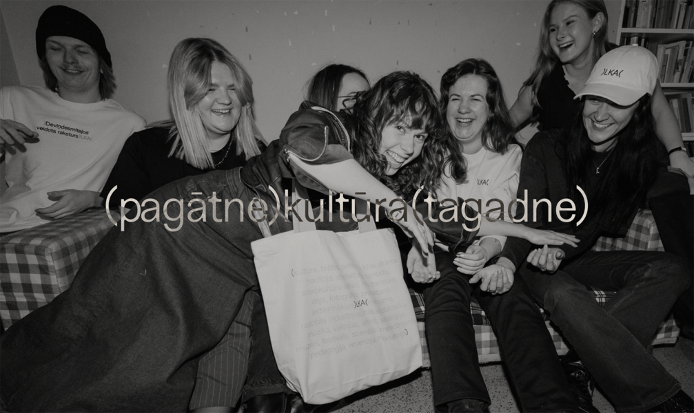
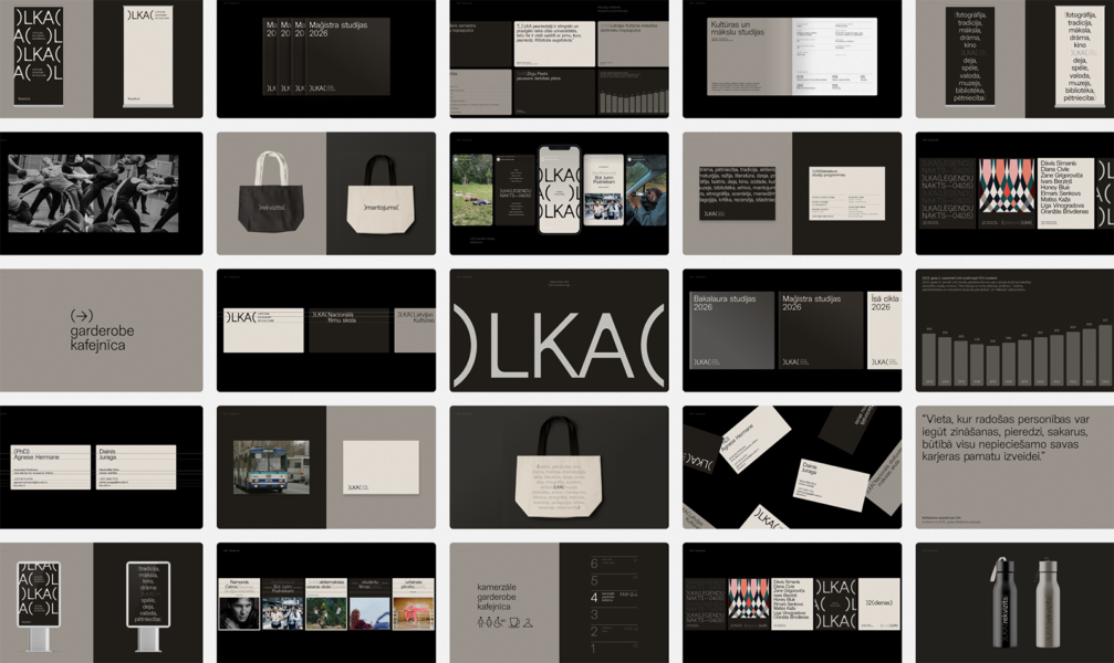
The new visual design is minimalist and primarily text-based. This approach was chosen to ensure that the visual identity does not compete with the vibrant creative expressions that emerge daily at LKA. The designers note that using text as the primary communication tool reinforces the value of the idea itself. Furthermore, language allows for the communication of both practical information and deeper concepts. To strengthen the LKA brand’s recognition, the visual identity employs a modified version of the New Edge 666 font, which was specially adapted for the academy’s needs by its creator, designer Charlotte Rohde.
The new visual identity is already visible on LKA’s social media and is gradually introduced in all of the academy’s communication channels — from digital media to printed materials. You can view the visual identity on the LKA website.

Viedokļi